
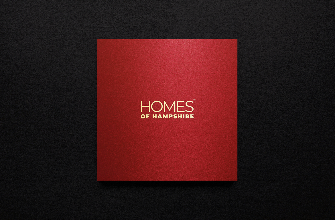
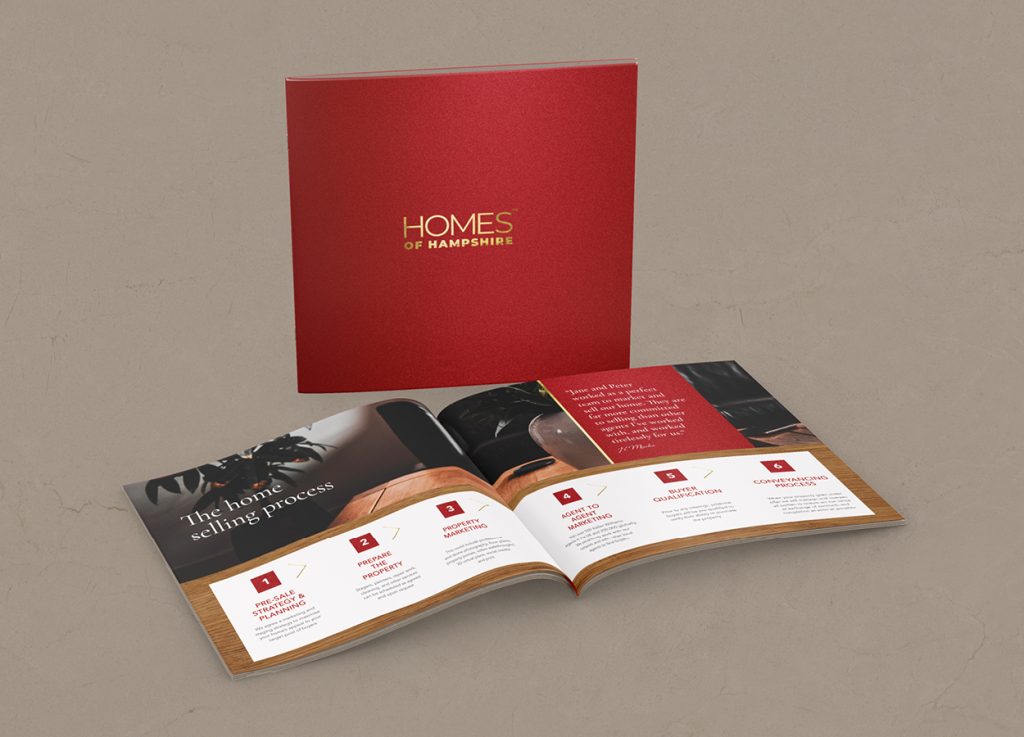
Home of Hampshire enlisted Dunstar Creative to redesign their brochure, aiming to elevate their brand and position them as a exceptional estate agency. The refreshed design is striking, with gold foil accents and an elegant red textured background that truly make it stand out. This is a brochure that draws attention and invites readers to explore it in detail.
Homes of Hampshire is not your typical high street agent. As a family-run business, they work with a smaller number of clients to give each one their full attention, and they partner with Keller Williams, the world’s largest real estate network. That combination of personal service and global reach deserved a brochure that reflected it properly: premium, distinctive, and confident enough to stand out in a competitive market.
The Creative Approach
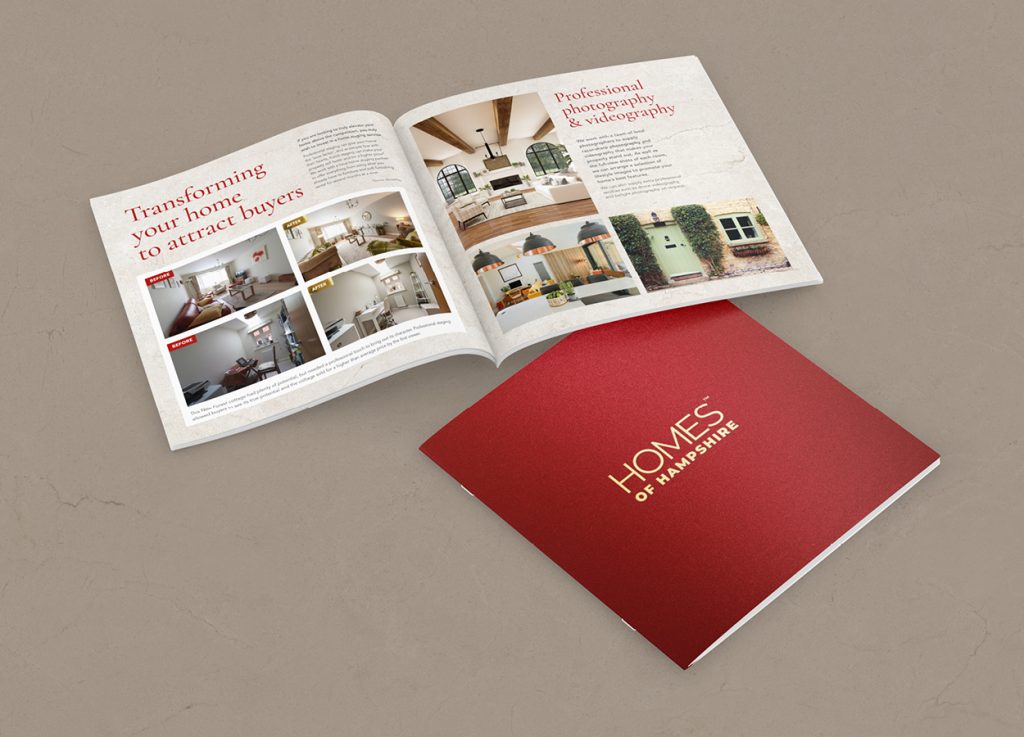
The redesigned brochure makes an immediate statement. A rich red textured background gives the piece a warmth and depth that immediately sets it apart from the clean whites and greys that dominate estate agency print. Gold foil accents add a layer of quality and craftsmanship, elevating the Homes of Hampshire identity and giving the brochure a tactile, luxury feel that invites you to pick it up and explore it.
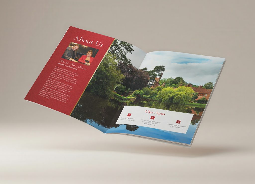
The interior layout is equally considered, with a clear visual hierarchy, generous use of space, and a design that lets the properties and the Homes of Hampshire story take centre stage. Every element works together to position the agency exactly where it belongs, at the premium end of the Hampshire property market.
The Result
A brochure that genuinely stands out, and one that works as a marketing tool rather than just a document. It reflects the quality, care, and personal attention that Homes of Hampshire brings to every client relationship, and gives the agency something it can hand over with real confidence.
Working on a brochure, a brand refresh, or print that needs to make a real impression? Get in touch and let’s talk about your project.
NEXT – Kate Underwood HR & Training