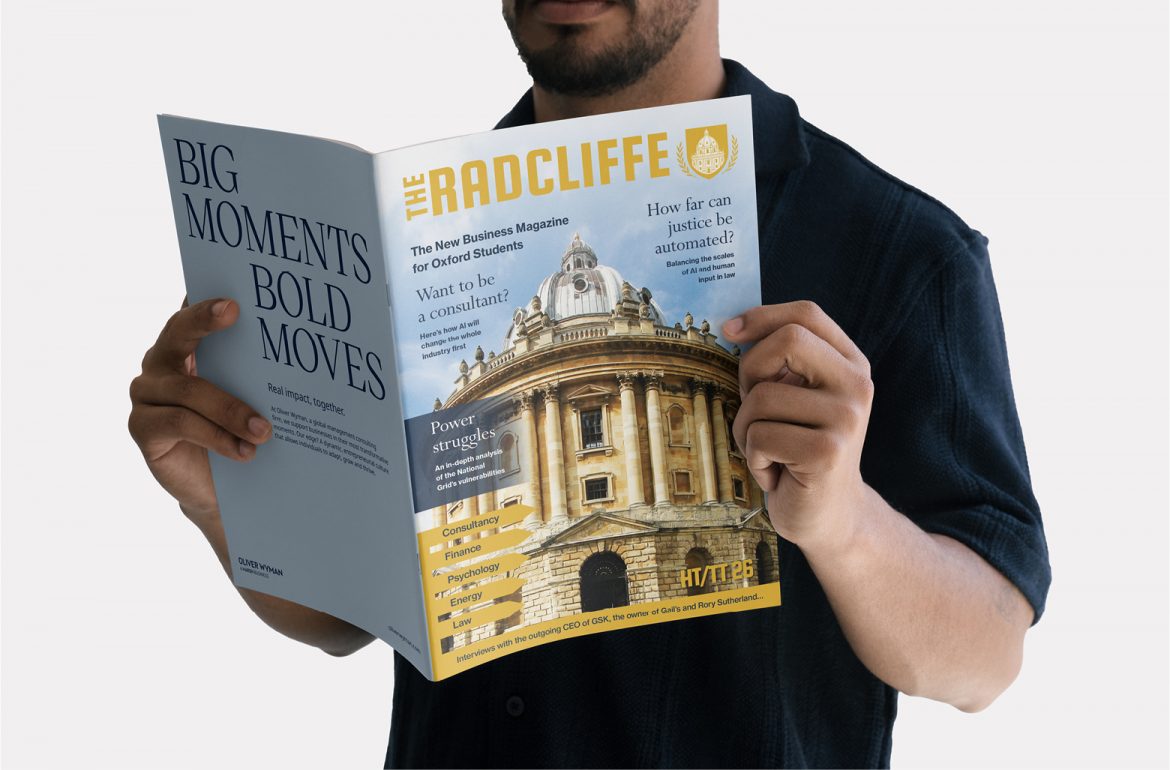
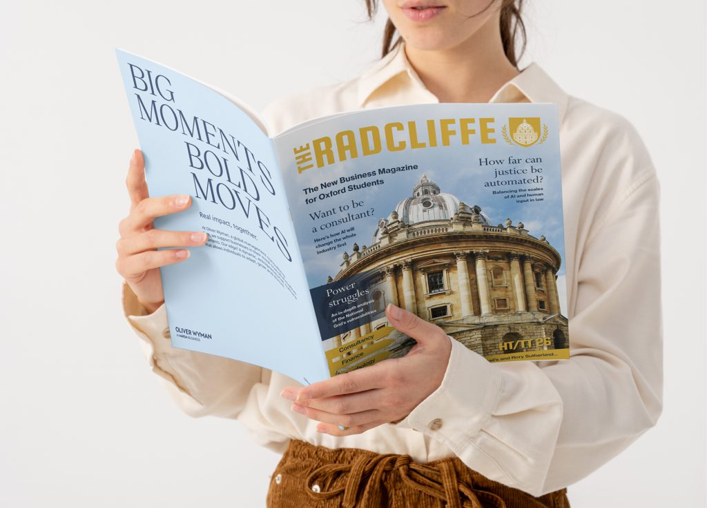
Radcliffe Magazine is a long-established editorial publication connected to the Radcliffe brand, designed to communicate ideas, stories, and updates in a clear, engaging, and visually refined format.
The project focused on redesigning and developing a contemporary magazine layout system that elevates readability, strengthens visual hierarchy, and brings a more cohesive editorial structure across the publication.
The goal was to create a design-led publication that feels both intelligent and accessible, balancing strong typography with considered pacing and imagery.
The Challenge
The existing magazine needed a more unified and modern editorial approach. While the content was strong, the layout system lacked consistency across sections, with varying typographic treatments and an inconsistent sense of hierarchy.
The challenge was to:
- Introduce a clearer and more flexible grid system
- Improve readability across long-form editorial content
- Create stronger visual rhythm and pacing throughout spreads
- Develop a consistent typographic structure for headings, subheadings, and body copy
- Elevate the publication to feel more contemporary while respecting its established identity
The Solution
A refined editorial design system was created to bring structure and consistency across the magazine.
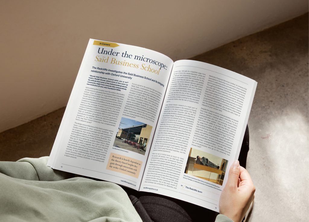
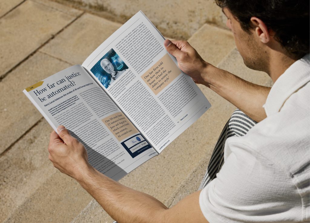
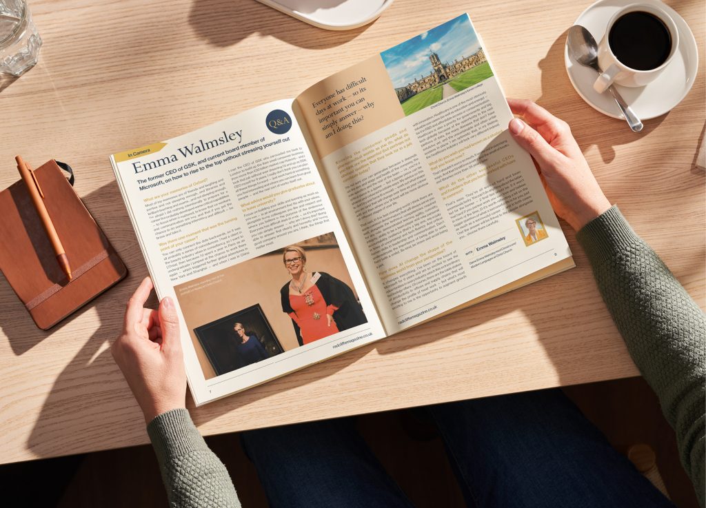
A modular grid approach allowed for flexible layouts while maintaining strong alignment and balance across spreads. Typography was carefully considered to improve hierarchy, ensuring clear separation between feature content, captions, and supporting information.
Photography and imagery were given more intentional placement, allowing visuals to support the editorial narrative rather than compete with it. White space and spacing rules were introduced to improve readability and create a more premium, editorial feel.
The overall design direction focused on clarity, pacing, and confidence — ensuring the magazine felt cohesive from cover to cover.
The Outcome
The redesigned magazine delivers a more structured and engaging reading experience, with improved clarity across all editorial sections.
Key improvements include:
- Stronger typographic hierarchy across all content
- More consistent page layout system
- Improved readability for long-form articles
- Better integration of imagery and editorial content
- A more refined, contemporary visual identity for the publication
The result is a magazine that feels more professional, considered, and aligned with modern editorial design standards.
Working on a magazine, editorial publication, or print design project? Get in touch and let’s talk about your project.
NEXT – Homes of Hampshire