Some briefs arrive with a really clear sense of purpose behind them. Meon Insights was one of those.
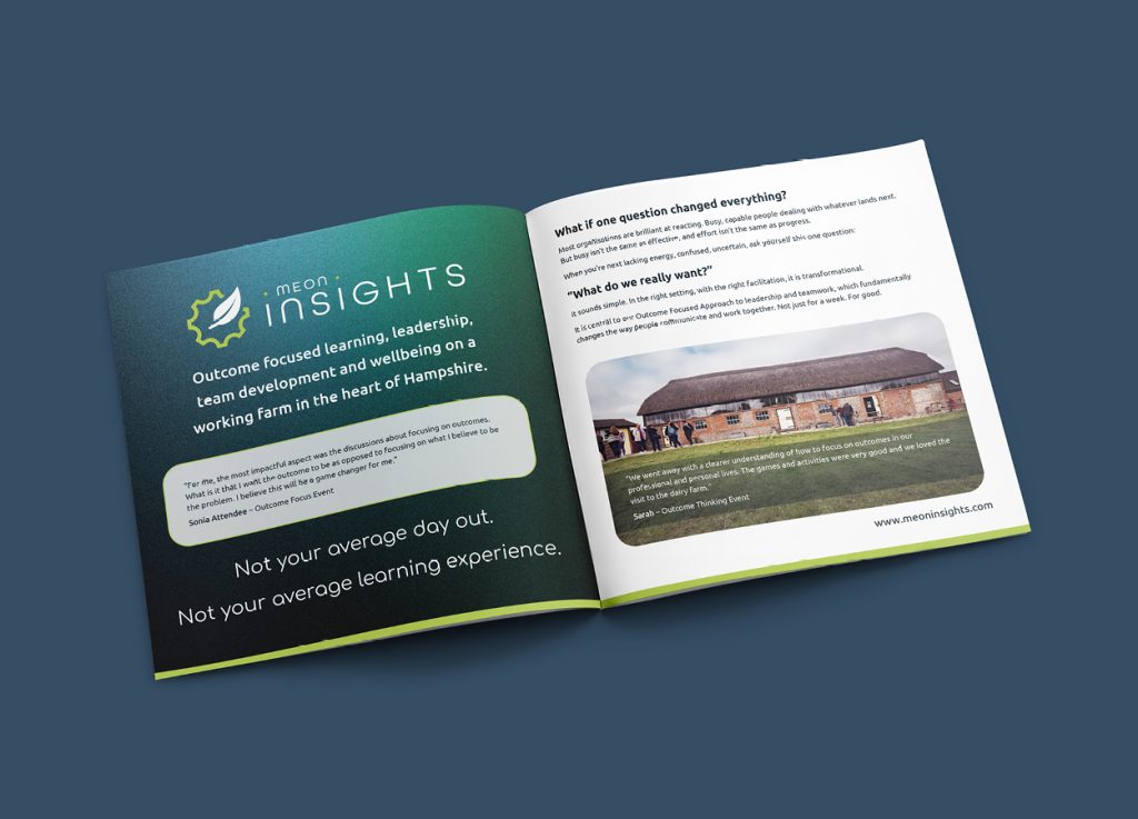
The training and development arm of Meon Springs, a diversified farming business set in a beautiful Hampshire valley, Meon Insights helps leaders and teams break free from a cycle of problem-solving and shift to something more powerful: an outcome-focused approach. The work is serious, the results are tangible, and the setting, 18th century thatched barns, fresh air, working farmland, is unlike any corporate training environment you’ve ever experienced.
They needed a brand identity that could carry all of that.
From logo development and visual assets throuh to digital applications, merchandise, and brad collaterl, every element was designed to create a cohesive and memorable brand experience.
From logo development and visual assets throuh to digital applications, merchandise, and brad collaterl, every element was designed to create a cohesive and memorable brand experience.
The Brief
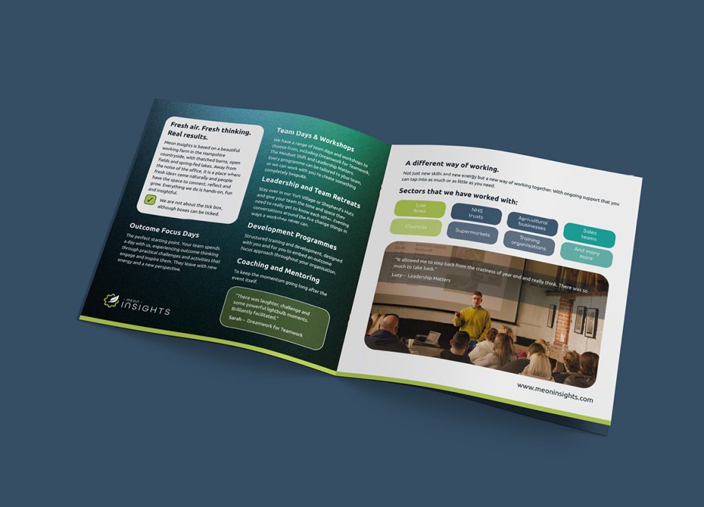
The challenge was to bring together several distinct qualities in a single coherent visual identity: professional credibility, warmth, a connection to nature and place, and a clear sense of forward momentum. The brand needed to work equally well on a business card, a branded water bottle, a company brochure, and a digital screen, while still feeling distinctive and human.
The challenge was to bring together several distinct qualities in a single coherent visual identity: professional credibility, warmth, a connection to nature and place, and a clear sense of forward momentum. The brand needed to work equally well on a business card, a branded water bottle, a company brochure, and a digital screen, while still feeling distinctive and human.
The Thinking Behind the Brand
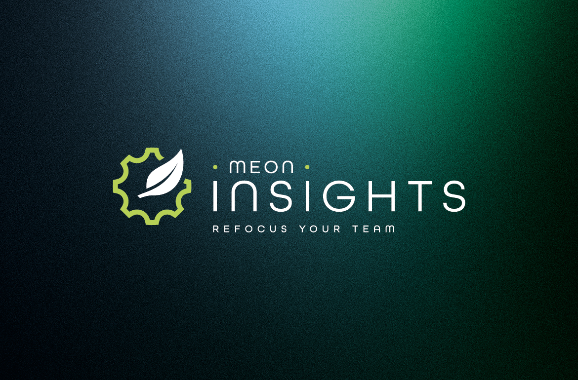
At the heart of the identity is a custom motif that combines a gear and a leaf. The gear represents structure, performance, and the mechanics of a well-functioning organisation. The leaf brings in growth, nature, and people, a nod to the Hampshire countryside that underpins everything Meon Insights does. Together they capture the balance that sits at the core of their methodology: precision thinking meets organic human development.
The tagline Refocus Your Team does exactly what good brand language should. It communicates the value proposition in three words, without resorting to corporate jargon. It’s direct, it’s memorable, and it feels like an invitation.
The tagline Refocus Your Team does exactly what good brand language should. It communicates the value proposition in three words, without resorting to corporate jargon. It’s direct, it’s memorable, and it feels like an invitation.
Bringing the Brand to Life
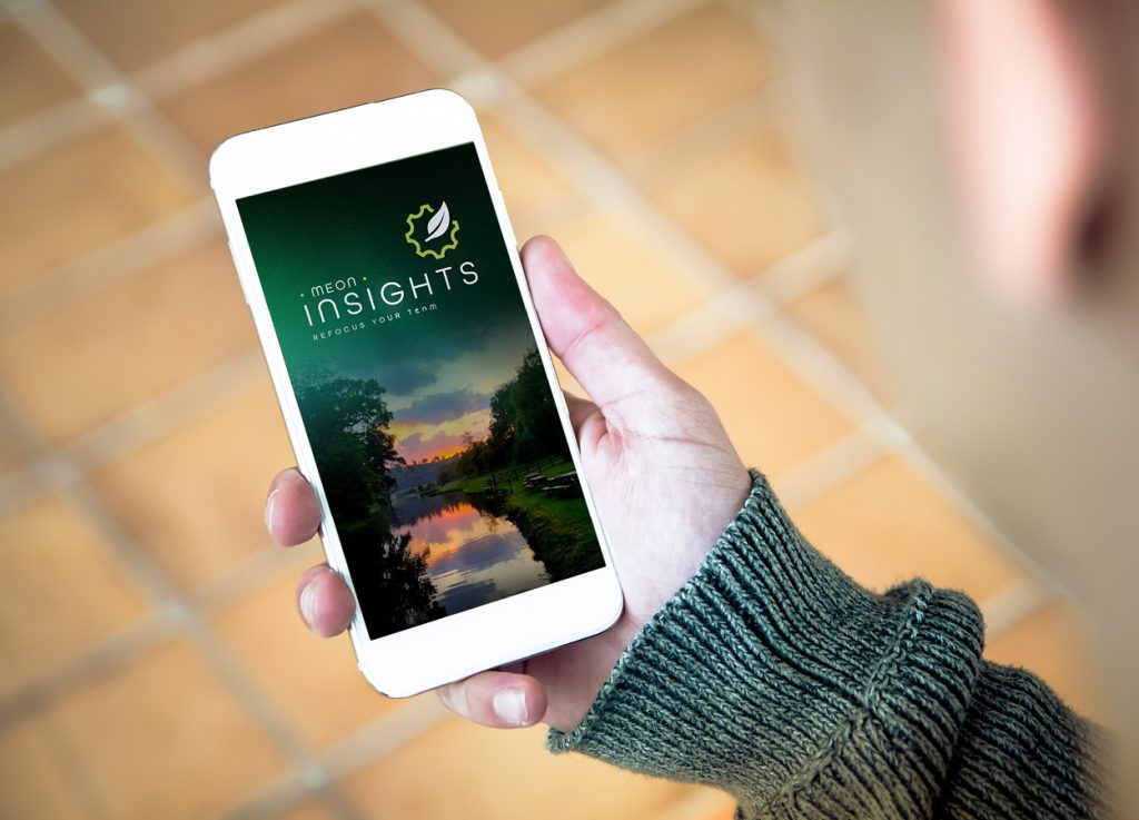
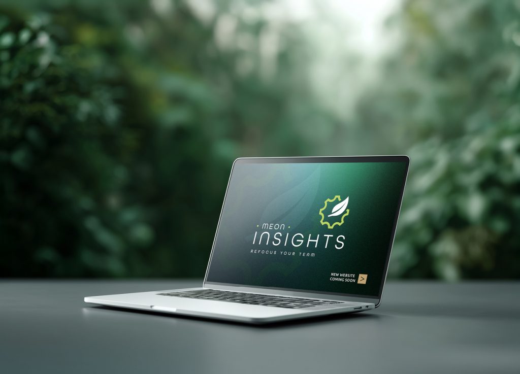
A brand identity only earns its keep when it holds together across every touchpoint, so alongside the core logo and visual assets we developed a range of concept visuals to show how the brand could live in the real world.
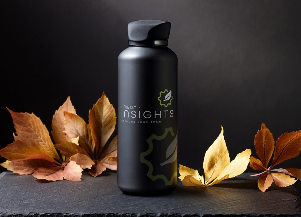
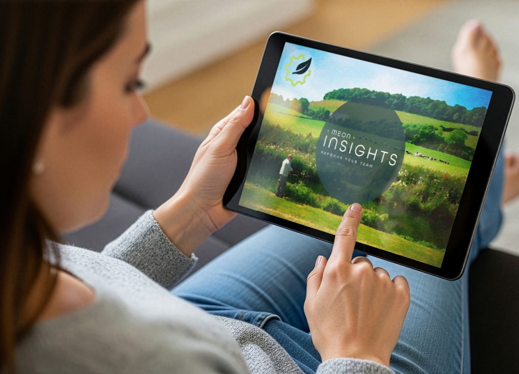
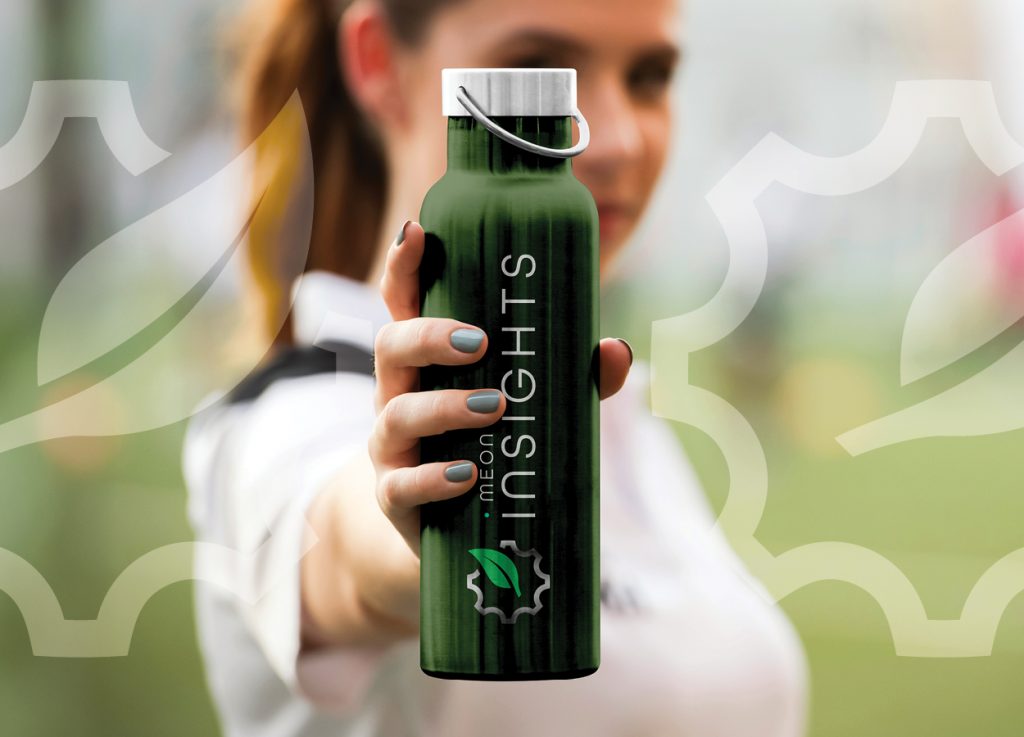
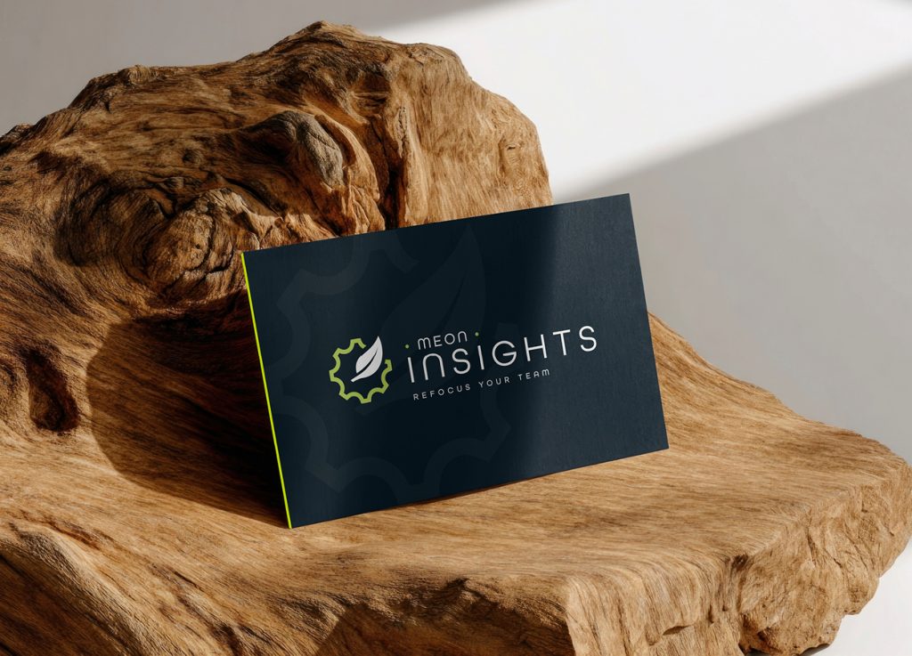
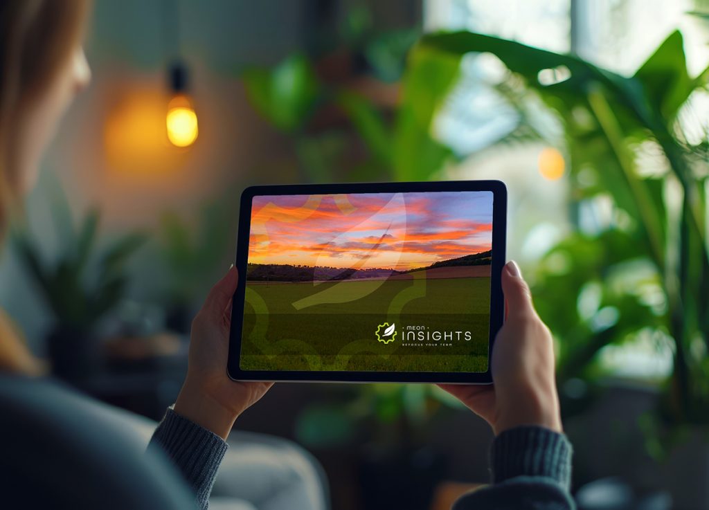
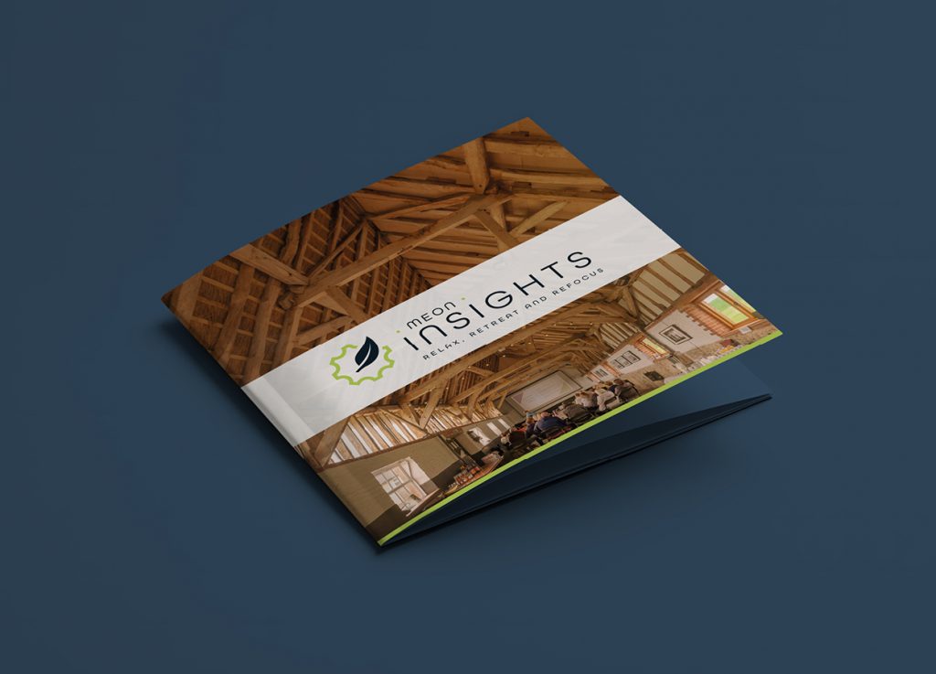
These include website mockups across mobile, tablet, and desktop, giving a clear sense of how the digital presence could look and feel. We also explored how the identity could translate into physical applications, with visuals showing laser-engraved wooden badges, branded water bottles, a company brochure, and business cards.
These are concepts and aspirations for now, but they serve an important purpose: demonstrating the full potential of the brand and how cohesively it could stretch across every touchpoint when the time comes.
The Result
A strong, distinctive brand identity with a clear visual language and the foundations to grow. Professional enough to stand alongside their clients’ boardroom-level expectations, warm enough to reflect the very human work they do.
When the strategy and the creative align this well, the possibilities are exciting. Watch this space.
Planning a rebrand, or building a new identity from the ground up? Get in touch and let’s talk about your project.
NEXT – RNPTBA – Graphic Design
